


A Collected, Lived-In Vision for Our Open Concept Living and Dining Room
- Tait Loughridge

- Aug 3, 2025
- 4 min read
Updated: Aug 5, 2025
Our home’s first floor is a single open space — living, dining, and kitchen all flowing together. That openness is part of the appeal, but it also makes thoughtful design more important. Without walls to separate zones, layout and materials have to do the heavy lifting.

This concept is my working plan for how to shape that space.
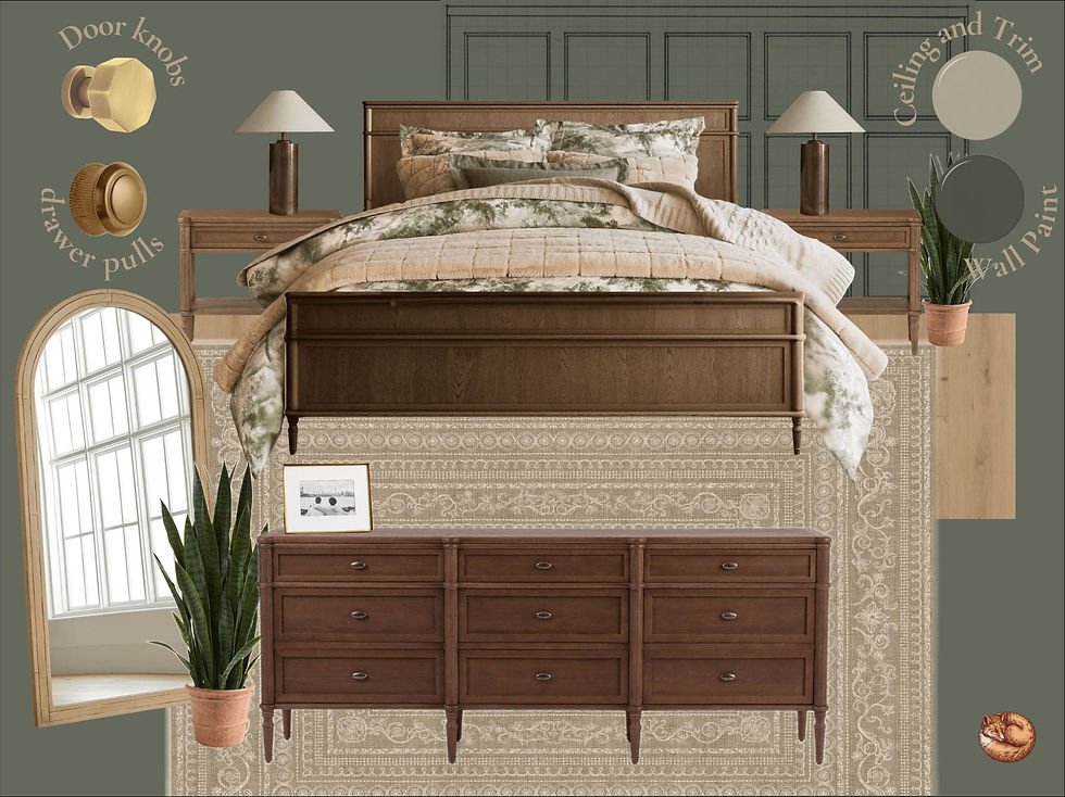
The area shown here — the combined living and dining zones — makes up a roughly 21 by 16 foot rectangle with 9-foot ceilings. It’s the first thing you see when you walk through the front door, so it needs to feel both welcoming and pulled together. I wanted it to have depth and character — grounded like a professor’s study, but still practical for everyday living.
Every item shown is a placeholder — a way to express mood, function, and direction. It’s not a final reveal. It’s a big-picture vision I’ll build toward over time.
Layout and Flow of Our Open Concept Living and Dining Room
This section of the first floor has always felt like a big blank rectangle — functional, but in need of definition. In this plan, I’ve started to divide the living and dining space using architectural detail, material changes, and furniture placement — not walls.

The living area sits to the left of the front door, anchored by a green-and-gold rug that ties together the Rosemary-painted walls, leather seating, and brass-toned accents. Panel molding adds structure and gives the space a more finished, intentional feel.
The dining side stays open to avoid crowding the entry, but the long wall becomes a focal point. A mural, framed in wall paneling, acts like a soft window — not to mimic a view, but to add visual depth. It brings direction to the room and creates a quiet moment of contrast.
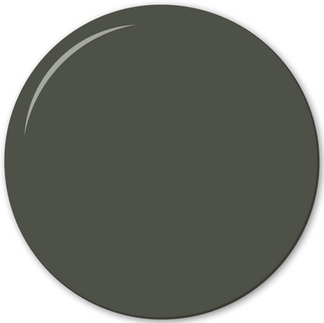
The ceiling shifts to Sherwin-Williams Ethereal Mood — a soft, muted green-gray that lightens the space without breaking the palette. The walls and all trim are painted in Rosemary, with the millwork finished in urethane enamel for subtle contrast in sheen and added durability.
Between the window and the front door, a built-in bookshelf helps divide the two zones. It’s just enough of a break to clarify function, while still keeping the space visually connected.
And because there’s only one window on the entire first floor, replacing the current solid front door with a glass-paneled version is a must. That update alone will dramatically increase the natural light on the dining side — and it’s likely the first change we’ll make.
(The kitchen — just beyond the dining space — isn’t included in these images, but it’s shown in the overall layout. That’s where we’re headed next.)


Furniture and Finishes
The materials here are chosen for real life. With cats in the house, leather is the most practical option — durable, wipeable, and resistant to snags. That’s why this concept leans on leather seating throughout, from the sofa to the dining area and beyond.
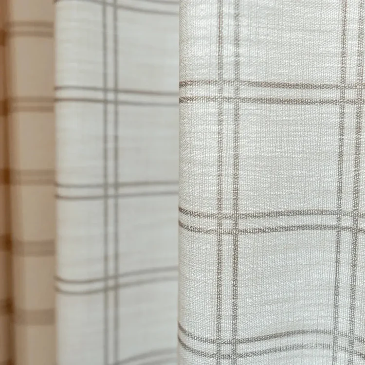
To balance the richness of the leather, the space brings in softness through textile curtains, throw pillows, and a green-and-gold rug that ties together the core tones — from the Rosemary-painted walls to the white oak floors and brass accents.
Flooring will eventually shift to warm white oak to add brightness and a natural base. Painted paneling and a soft ceiling color add texture without visual noise. Accent lighting and personal touches — like family photos in a mix of wood and brass frames — help the open concept living and dining room feel finished without feeling over-styled.
The overall goal: a space that feels lived-in, not staged. Collected, not curated. Designed to be used.


Final Thought
Right now, this space is still in its early stages. The layout works, but the finishes, lighting, and furniture don’t yet reflect the tone we’re aiming for — and that’s okay. Design is a process. This concept gives us a map to follow as we update things piece by piece.
Swapping in a glass-paneled front door will likely be the first real change. It solves a practical problem — bringing in more natural light — but also supports the overall direction of the design. And that’s the goal: every small update should help shape the big picture.
We’re not making these changes all at once, but starting with a clear vision means every decision moves us closer. This room connects everything on the main floor, so it matters that it reflects how we live.
Design doesn’t have to be fast to be thoughtful. This is just one part of a larger story — a space that blends comfort, character, and clarity from the moment you walk in the door.
And since this room flows right into the kitchen, that’s where we’ll go next in the series. In an open-concept home, no space stands alone.
Want to bring this look to life in your own home?
Below are some of the key pieces I selected to shape this concept.
Hover over each item to see the name and click through to its source.


These are the paints I’d use to bring the mood to life — rich and comforting, but never overwhelming.


All product images link to their respective brand sources and are used for design inspiration only.


Comments